A centered CSS grid with full-width components
- Published at
- Updated at
- Reading time
- 2min
Not too long ago, I was looking into refactoring my site to go all in with CSS grid!
I've been aiming for a classical centered blog layout with flexible side margins. The content should be 65 characters wide at max. But (!) I wanted to be able to break free, and some components should go full-width by setting a class. And it should all work with CSS grid.
After fiddling with it for a while, I didn't reach a satisfying result and decided to do it another day. In the meantime, Ryan Mulligan's post "Layout Breakouts with CSS Grid" provided the CSS solution I was looking for (see it in action on CodePen).
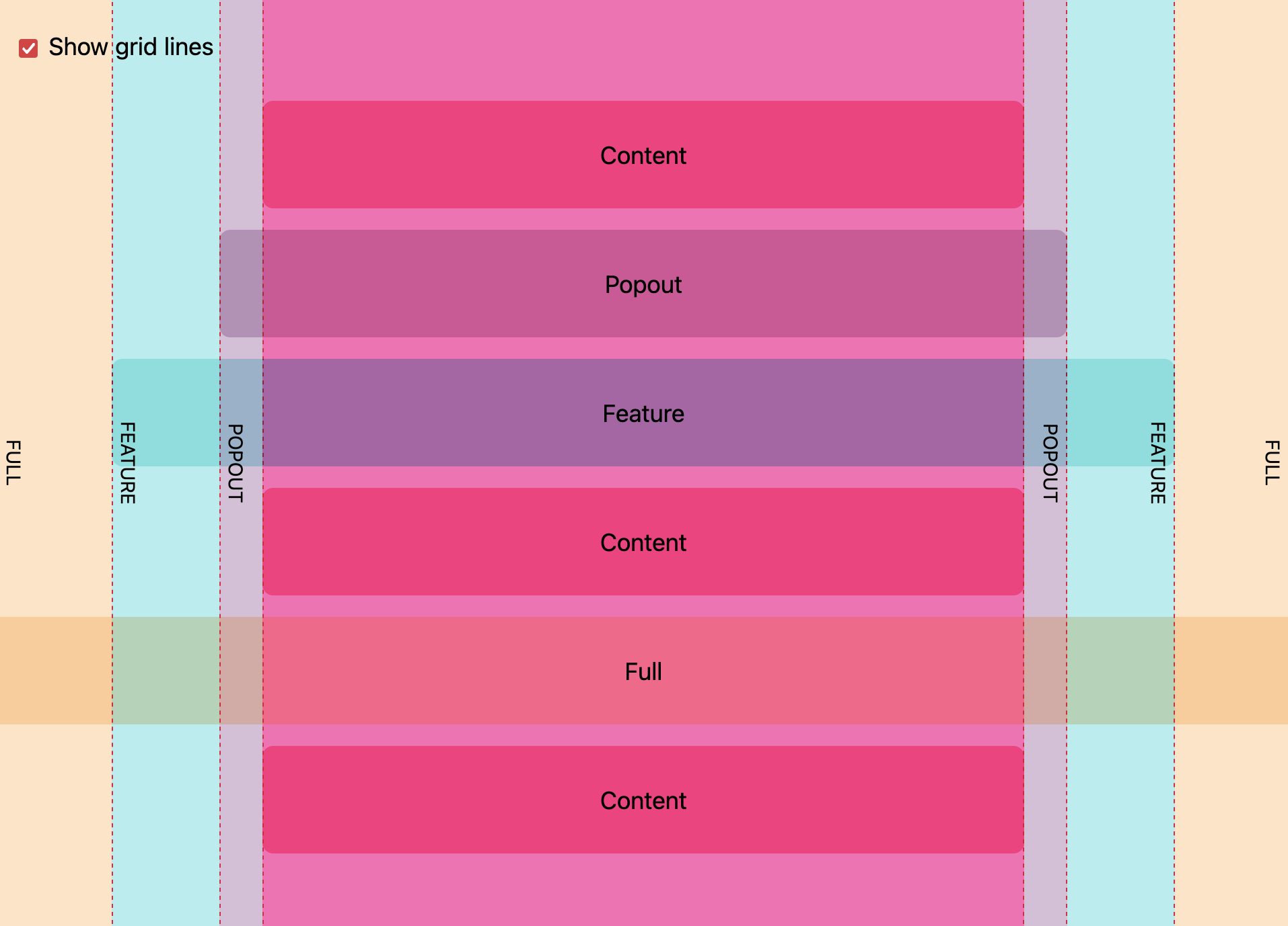
Put all your content in a content wrapper element that defines named grid areas:
.content {
  --gap: clamp(1rem, 6vw, 3rem);
  --full: minmax(var(--gap), 1fr);
  --content: min(50ch, 100% - var(--gap) * 2);
  --popout: minmax(0, 2rem);
  --feature: minmax(0, 5rem);

  display: grid;
  grid-template-columns:
    [full-start] var(--full)
    [feature-start] var(--feature)
    [popout-start] var(--popout)
    [content-start] var(--content) [content-end]
    var(--popout) [popout-end]
    var(--feature) [feature-end]
    var(--full) [full-end];
}
And then control all the component widths using grid template areas. 💯
.content > * {
  grid-column: content;
}
.popout {
  grid-column: popout;
}
.feature {
  grid-column: feature;
}
.full {
  grid-column: full;
}
The post even includes a beautiful visualization that explains what's going on. 👏
I love it. 💙 Thank you, Ryan!

Join 6.4k readers and learn something new every week with Web Weekly.

