How to define Open Graph / Twitter image alt text (and why it might not matter...)
- Published at
- Updated at
- Reading time
- 4min
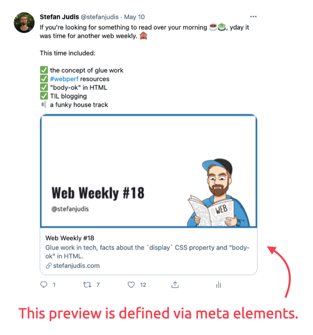
You know all these fancy link previews that you see on social media when people share articles and resources, right? These previews are based on various meta elements defined in your website's head. You can define the Twitter card layout using <meta property="twitter:card" content="summary_large_image">, specify the Facebook preview image with <meta property="og:image" content="https:// and many more configuration options.
Read more about the details in the documentation:
Recently I learned that the two standards (Open Graph and Twitter cards) support alternative text for preview images. I want to be a good web citizen and implemented it right away.
Unfortunately, I discovered that the alternative text definition might not matter much for Facebook or Twitter. That's a bummer; read on to learn more. 😉
Thanks to my friend Feli (and Lea Rosema and Manuel Matuzović) I discovered Open Graph's <meta property="og:image:alt " content="Your image alt text"/> element.
It turns out that not only Open Graph but also Twitter allows alternative text using <meta property="twitter:image:alt" content="Your image alt text">.
That's very exciting! Ideally, these meta elements would allow us to define the alternative text for the images displayed on Twitter and Facebook to make them more accessible for assistive technology.
Let's look at how Facebook and Twitter render my site's URL previews!
Let's have a look at how Facebook and Twitter render image alternative text in their previews.
Twitter's preview cards
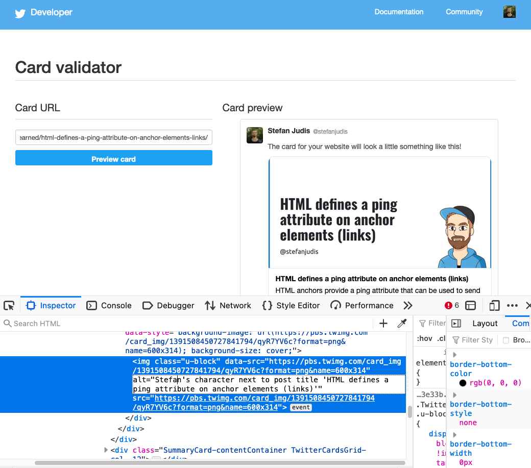
I went to the Twitter Card validator to check my site, and it looked great!
The alternative text was set correctly in the validator preview. The next step was to check how Twitter renders the previews inside of their UI.
Twitter caches all their previews for a while, and because I just deployed the twitter:image:alt I couldn't check if it's rendered the same way the validator did.
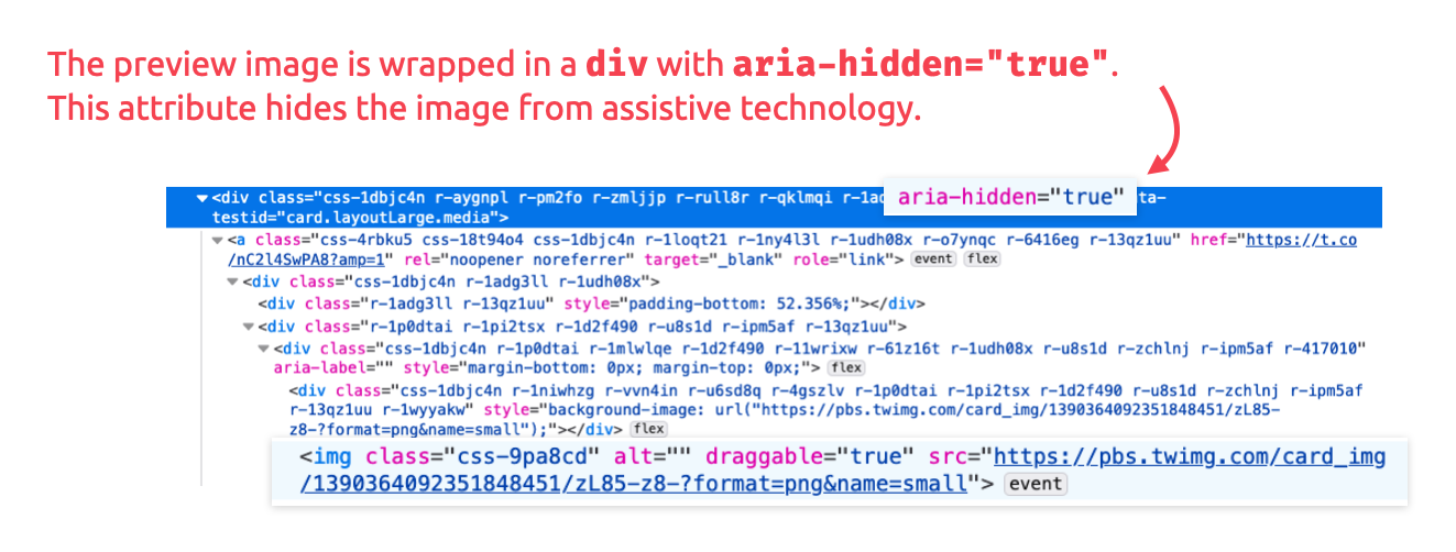
Nevertheless, I still had a look at the rendered HTML and found out that Twitter renders the preview image in many many divs and one of them includes the aria-hidden="true" attribute. 😲
. That means that the new alternative text (if it shows up) won't improve the screen reader experience because screen readers won't discover the image after all.
Edit: Twitter renders the preview image alternative text depending on the content of the twitter:image:alt meta element. 🎉
This discovery was disappointing, but I moved on to Facebook to find some improvements over there.
Facebook's link preview
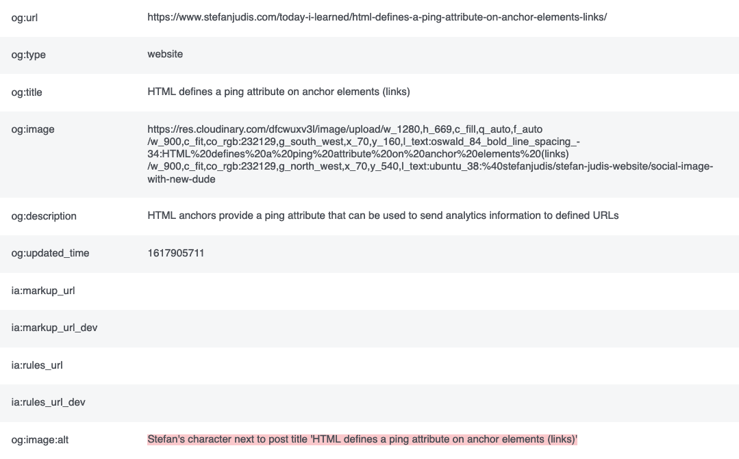
Similar to Twitter, Facebook also provides a preview tool – the sharing debugger. I checked one of the URLs that now include og:image:alt. Everything showed up correctly in the debugger's info section. 🎉
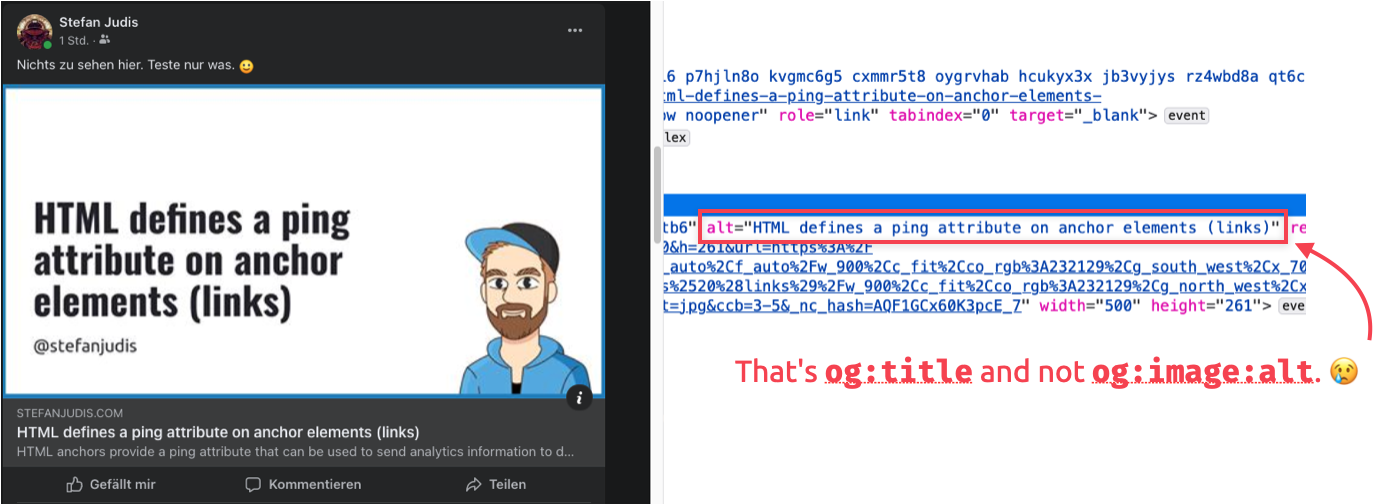
Unfortunately, the alternative text was not showing up in the debugger's preview. I shared a URL on Facebook to see my new alternative text in production. Luckily the image doesn't seem to be hidden from the accessibility tree, but(!) it appears that Facebook uses og:title instead of og:image:alt for the image alternative text. 😢
I guess too few people are using og:image:alt so that Facebook goes with the title to be on the safe side.
These two discoveries bring up the question: should we bother implementing social media preview alternative texts if it doesn't improve the previews' accessibility?
I will keep the og:image:alt and twitter:image:alt meta elements on my site. The elements are not harming the overall experience (I'm ignoring the few bytes of additional HTML), but unfortunately, they're not making social media previews more accessible either.
If Facebook and Twitter change their implementation in the future, I'll be ready with correct alternative texts at least.
Side note: John Kemp Cruz also pointed out that Twitter falls back to Open Graph for particular properties. Good to know!

Join 6.5k readers and learn something new every week with Web Weekly.
